Chart Window: Overview
The Chart Window in the Results Viewer lets you create time-series Line Charts and Column Charts to help you analyze your Result Scenarios. Key features of the Chart Window include the ability to easily compare output from multiple Scenarios, and to interactively drill down into the details of your results.

Chart Window Layout
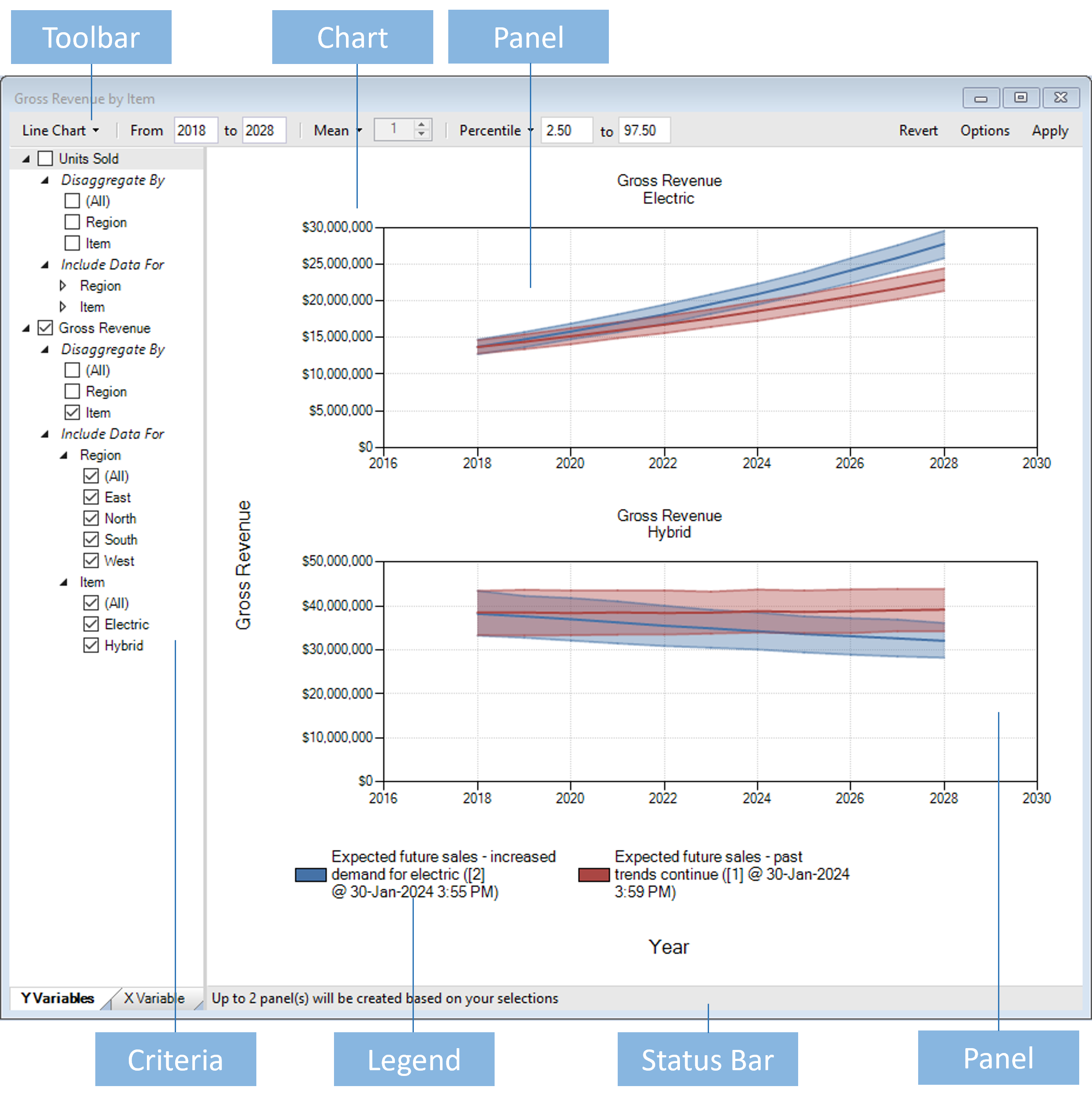
The image above shows the Chart Window for the Chart Gross Revenue by Item which comes with the Demo Sales - Basic Template. Note that the Chart Window is divided vertically into two child panes:
Criteria Pane
The pane on the left is the Criteria Pane. You use the Criteria Pane to choose the Variables you want to see in your Charts. The example above shows a chart for the Gross Revenue Variable.
Chart Pane
The pane on the right is the Chart Pane. This windows contains the Chart and all of its child elements, such as Titles, Chart Panels, and Legend.
About Chart Panels
The most important type of child element in a Chart is a Chart Panel. A Chart Panel is where you see the data time-series rendered as a Line or a Column. The image above shows two Chart Panels:
- Gross Revenue - Electric
- Gross Revenue - Hybrid
As you can see, each Panel has a Title, Y axis, X axis, and multiple time-series (one per Scenario) displayed as either a line or a column.
Note
It is helpful to understand the difference between a Chart and a Chart Panel: A Chart is a simply a container (with a name) for one or more Chart Panels.
Comparing Scenarios
As mentioned above, the Chart Window lets you compare data sets from multiple Scenarios at the same time. In the example above, two Results Scenarios are being compared:
- Expected future sales - past trends continue...
- Expected future sales - increased demand for electric...
As you can see, each Panel has a separate time-series for each Scenario, and the Legend shows you which color is used to render each time-series.
Using the Toolbar

You can use the Toolbar at the top of the Chart Window to set the Chart Type, Timesteps, Iteration Type, Error Bar Type, and access the Options dialog.
The various controls in the Toolbar have a number of different behaviors, but there is one common behavior that is important to note: you must click the Apply button for your changes to be reflected in the current chart. For example, if you change the Timesteps you must click the Apply button for those changes to take effect.
Also, note that some Toolbar buttons are drop-down buttons which show a list of options when you click on them. In the image above, the Iteration Type is currently set to Mean.
Tip
If you hover the mouse over a button you will see a tooltip explaining the purpose of each control.